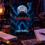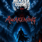
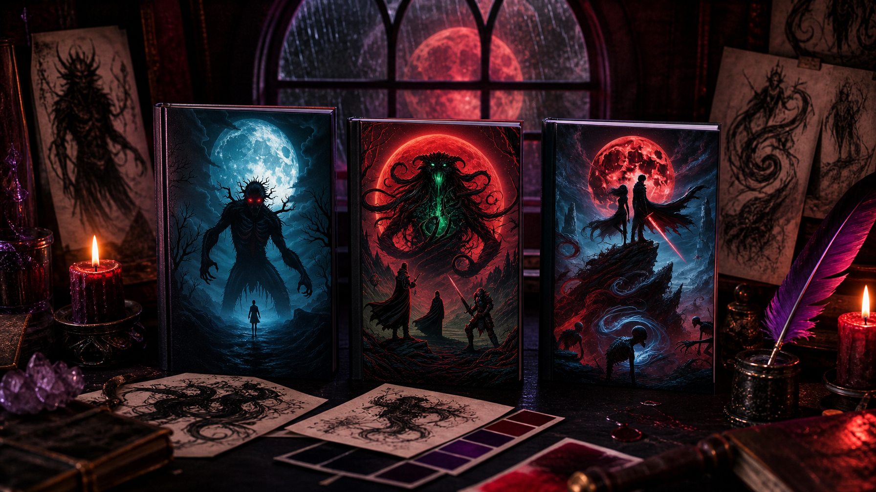

Before a reader opens the first page of The Moon's Curse: Awakening, they have already formed an impression of the world inside it. They have seen the cover. They have registered the typography, the color, the atmosphere contained in a single image. That impression — the one formed in the half-second before a decision is made — is not accidental. It is the result of dozens of deliberate choices made long before a single copy was printed.
This is the story of those choices.
The Problem with Generic Fantasy Covers
When I began thinking seriously about the visual presentation of The Moon's Curse Trilogy, I spent a significant amount of time studying what already existed on the shelves and in dark fantasy feeds online. What I found was a landscape flooded with similar silhouettes, similar glows, similar color palettes approximating what "fantasy" is supposed to look like. Figures in fog. Glowing orbs. Blades catching light at practiced angles.
None of it was wrong. But none of it was specific.
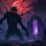
The Moon's Curse is not a generic dark fantasy series. The Nythrall are not traditional monsters. The Veil is not a standard magical barrier. The Covenant is not a simple good-versus-evil conflict. If the covers looked like every other fantasy on the market, they would communicate exactly the wrong thing — that the world inside is familiar, safe, and predictable.
The covers needed to promise something more unsettling than that.
Starting with Color as Language
The first decision was the palette. Every color choice in the Londyn Publishing visual identity carries deliberate meaning.
Deep violet (#7C3AED) became the primary brand color because violet sits at the edge of visible light — it is the color of dusk, of transition, of the threshold between one state and another. That quality maps directly onto the Veil itself: a boundary that is neither fully present nor fully gone. Violet communicates ancient, restrained power.
Crimson-rose (#B3626A) functions as the accent because blood is never far from the center of this story. Not gore — consequence. The Blood Moon is not violent for its own sake. It is the scheduled arrival of a debt. The crimson in the brand palette carries that weight: warmth cut through with something colder underneath.
The near-black background (#111827) is not simply darkness. It is the particular darkness of deep space or deep water — not empty, but full of things that have not yet moved toward the light.
Together, these three elements produce an atmosphere before any image is applied. The palette itself is the first world-building decision.
Typography as Architecture
The second decision was typography, which in a publishing brand functions as architecture: the structure that everything else is built inside.
Cinzel Decorative for display headings — because it carries the weight of inscribed stone. Monuments. Covenant texts. Ancient things that were never meant to be forgotten.
Cormorant Garamond for body headings — because it is elegant without being delicate. It suggests scholarship, manuscript, the work of someone who has spent decades studying something most people would not have believed existed.
Inter for body text — clean, readable, never calling attention to itself. When a reader is deep inside a chapter, the typography should be invisible. Inter earns that invisibility.
These are not aesthetic preferences. They are tonal commitments. Every piece of Londyn Publishing communication — from the website to the book interiors to social content — is held inside this same architectural frame.
What Each Cover Had to Do
Each book in the trilogy carries a different emotional weight, and the covers were designed to reflect that progression.
Awakening needed to feel like the beginning of something vast — the sense that you are standing at the entrance to a world far older than you. Discovery, with an undercurrent of dread.
Descent needed to communicate the shift inward — the point in the story where the world has stopped being something happening around the characters and has started happening to them. More shadow. Less open space.
Blood Moon needed to feel inevitable. Not frightening in the way a jump scare is frightening, but in the way a storm front is frightening when you watch it approach and realize there is no outrunning it.
A reader who picks up all three and holds them together should feel the story before reading a word.
The Brand Beyond the Books
Londyn Publishing was never conceived as a pen name or a self-publishing label of convenience. It was built as a proper publishing imprint — with the expectation that the universe of The Moon's Curse would expand, and that every visual element of the brand needed to scale alongside it.
The Beyond the Veil extras vault, the website, the companion lore content, the social presence — all of it is held inside the same visual and tonal system. The Nythrall look the same whether you encounter them in a novel, a character illustration, or a lore post on the website. The Veil feels the same in a chapter and in a marketing image.
That consistency is the brand. Not the logo. Not the color palette. The consistency — the sense that everywhere you encounter Londyn Publishing, you are encountering the same world.
What This Means for Indie Authors
If you are building an independent publishing brand, the lesson I would offer is this: design is not decoration. It is the first chapter of every reader's experience with your work. It tells them whether this world is worth entering before they have read a single line.
Invest in the visual identity the way you invest in the prose. Make it specific. Make it yours.
The dark does not have to look like everyone else's dark.
The Moon's Curse Trilogy — Awakening, Descent, and Blood Moon — is available now in paperback, hardcover, and eBook at londynpublishing.com. Explore the world Beyond the Veil.