
For discerning dark fantasy readers and dedicated book collectors, a physical book is far more than a delivery vehicle for text. In an era dominated by digital downloads and rapid-release cycles, the physical artifact possesses an enduring power: the weight of heavy paper, the crisp tactile snap of opening a sewn case, the subtle shimmer of metallic foil catching candlelight, and the scent of fresh ink on archival vellum. In speculative fiction, where authors spend years building immersive worlds governed by ancient rules, treating the exterior cover as mere disposable marketing misses a vital storytelling opportunity. Mastering indie dark fantasy cover design means transforming the exterior casing into an authentic narrative artifact that prepares the reader to cross the threshold into the story.
When an author embraces the dual role of storyteller and independent publisher, production choices change entirely. Rather than chasing generic stock-photo trends, every production layer can be calibrated to reflect the story’s internal mythology. From tactile foil stamping and custom spine typography to cartographic endpapers and unjacketed cloth covers, physical book design becomes the first chapter of worldbuilding.
1. The Front Threshold: Narrative Intent Over Stock Trends
Commercial fantasy shelves are frequently crowded with homogenous cover trends: floating character heads rendered in oversaturated digital paint, generic cloaked figures staring into neon portals, and interchangeable title treatments. While these conventions signal broad genre categories, they rarely convey the atmospheric depth, moral friction, or dread of serious dark fantasy.
A bespoke dark fantasy cover should operate like an ancient municipal signpost or a recovered covenant relic. Key design principles include:
- Symbolic Restraint: Enduring dark fantasy designs often employ focal architectural motifs, intricate heraldic sigils, or physical boundary instruments rather than crowded character montages. A single cold-iron boundary compass, a cracked stone covenant pillar, or an anatomical rendering of an original creature immediately communicates an uncompromising tone.
- Deliberate Typographic Hierarchy: As we explored in our breakdown of dark fantasy book interior design, typographic consistency must bridge the exterior and the interior. Title typography set in classical letterforms, such as chiseled serifs with custom ligatures, establishes historical gravitas before the reader turns the first page.
- Atmospheric Palette Control: True darkness on a book cover does not mean muddy black ink. It demands calculated tonal contrasts: deep charcoal obsidian, midnight violet, and rich burgundy accents that evoke moonlit frontier nights and ancient bloodlines.
2. Tactile Finishes: Foil Stamping, Blind Debossing, and Cloth Textures
The tactile sensation of holding a volume creates an immediate neurological connection between reader and tale. In high-stakes dark fantasy, where magic behaves like contractual property law and characters interact with physical anchors like cold-hammered iron and boundary salt, the book’s exterior finishes should mirror that tactile weight.
For special editions and hardcover print runs, specific physical treatments elevate the collector experience:
- Metallic and Matte Foil Stamping: Introducing muted silver, antique bronze, or crimson foil to key sigils and title lettering creates dramatic depth under low light. Under candlelit reading conditions, the foil catches reflections while the surrounding matte paper recedes into deep shadow.
- Blind Debossing: Pressing detailed covenant inscriptions, border treaties, or geometric sigils directly into the cloth or case wrap without foil creates physical contours readers can feel beneath their fingertips. It transforms the cover into a weathered stone tablet.
- Soft-Touch and Linen Case Wraps: Avoiding slick, glossy laminates in favor of soft-touch matte finishes or woven linen textures prevents glare, resists fingerprints, and gives the book the dignified feel of an archival folio found in a remote frontier cloister.
3. Shelf Presence: Spine Architecture Across a Complete Trilogy
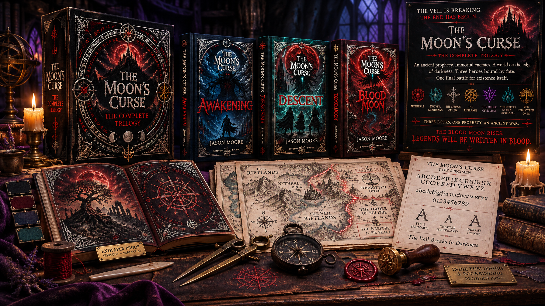
While the front cover drives the initial impression, a book spends most of its physical life standing on a shelf. For an epic multi-volume story like The Moon’s Curse Trilogy, spine architecture requires forensic planning across all three installments simultaneously.
When an indie author chooses to write a dark fantasy trilogy upfront, that production advantage extends directly into visual presentation. Rather than redesigning spines on the fly between staggered releases, the entire shelf footprint can be harmonized:
- Unified Horizontal Alignments: Author name, series logo, volume numbers, and publisher colophons must align across Awakening, Descent, and Blood Moon with millimeter precision. Inconsistent spine heights immediately fracture a collector’s shelf aesthetic.
- Connected Spine Art and Geometric Progression: Spines can incorporate connecting boundary sigils, escalating moon phases, or shifting color bands that visually chart the collapse of the Veil as the reader moves through the trilogy.
- Spine Width Calculations: Calculating exact spine bulk based on confirmed final page counts, paper calipers, and binding styles ensures that foil stamping sits dead center, eliminating unsightly wraps onto front or back panels.
4. Interior Immersion: Custom Endpapers and Archival Details
Opening the front cover of a premium dark fantasy hardcover should feel like unsealing a private archival vault. The transition from the exterior world into the story begins with the endpapers pasted to the inside boards.
Instead of leaving endpapers blank or using generic solid colors, independent publishers can enrich the reading experience through dedicated lore integration:
- Cartographic Border Surveys: Printing high-resolution regional maps across the front and rear spreads allows readers to trace the geographical movements of scouts like Evan Hartwell along the Rimward Margin, or locate the fortified scriptoriums where covenant scholars translate failing treaties.
- Archival Covenant Clauses: Incorporating faint, calligraphic charter text, municipal seal reproductions, or liturgical boundary decrees into endpaper patterns grounds the world’s institutional realism before chapter one begins.
- Headbands and Ribbon Markers: Coordinated woven headbands and silk ribbon page markers in deep violet, charcoal, or blood red reinforce the book’s identity as a cherished, permanent volume built to withstand multiple rereads.
5. The Indie Publisher’s Advantage: Uncompromising Creative Control
Traditional publishing often forces books through corporate marketing committees, resulting in homogenized cover designs that prioritize mass-market familiarity over artistic intent. Independent publishing gives the author complete autonomy over every physical specification: selecting custom paper weights, commissioning bespoke hand-lettered typography, engineering elaborate foil stamping dies, and crafting matching collector sets.
For readers who value deep lore, authentic atmosphere, and enduring physical craftsmanship, that creative independence shines through every edge, foil impression, and sewn signature. When physical production mirrors narrative intensity, the resulting book is not merely read, it is treasured.
Step Beyond the Veil
Discover an unbroken dark fantasy saga crafted with relentless attention to worldbuilding, atmospheric tension, and collector-grade physical editions. Explore the complete Moon’s Curse Trilogy, Awakening, Descent, and Blood Moon, available in paperback, hardcover, and digital formats at londynpublishing.com.