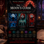

Every author knows the relief of finishing a draft, but in indie publishing, finishing the manuscript is only half the contract. At Londyn Publishing, once the final continuity passes across twelve hundred pages were locked, the work moved directly to the typesetting desk. Designing the interior layout for an atmospheric, lore-heavy dark fantasy saga demands far more than choosing an attractive font. The quiet craft of dark fantasy book interior design requires treating the physical page as an extension of the world itself.
When a reader opens a dark fantasy novel, typography and layout either reinforce immersion or quietly puncture it. A fragile font choice can turn an ancient, unforgiving empire into something flimsy. An overly cramped gutter can bury crucial dialogue, while excessive decorative flourishes make the prose feel like a costume drama. To preserve the relentless tension of The Moon’s Curse Trilogy, every typographic rule on the page had to reflect the same consequence and institutional weight that governs the narrative.
1. Typography That Matches the Narrative Weight
Fantasy typography often falls into one of two traps: defaulting to generic book faces designed for contemporary fiction, or overloading the headers with faux-medieval display fonts that exhaust the reader’s eye by chapter three.
In dark fantasy, typography must feel grounded, readable, and quietly severe. The reading experience demands a sturdy body typeface with enough ink weight to hold its own against dark themes without tiring the reader across long chapters. Running headers, section breaks, and chapter openers should carry an architectural dignity. When introducing elements like the moon-bound Nythrall or ancient covenant registries, the type cannot beg for attention. It should mirror the stone arches, cold iron anchors, and weathered parchment of the setting.
2. Proportions, Leading, and Atmospheric Breathing Room
Atmospheric dread requires physical space on the page. In horror and dark fantasy, pacing is not dictated solely by punctuation; it is influenced by line length, leading, and white space.
Tension thrives on deliberate pacing. If lines are packed too closely, fast-paced action sequences collapse into an intimidating block of text. Conversely, if leading is too loose, the atmospheric density dissolves. Finding the balance requires strict attention to proportional margins:
- Gutter Margins: Ensuring sufficient depth so that prose does not curve inward toward the spine, forcing readers to physically wrench the book open during intense scenes.
- Running Headers and Folios: Keeping chapter markers unobtrusive so the reader remains immersed in the scene rather than continually reminded of page counts.
- Scene Break Anchors: Using restrained glyphs or clean geometric rules rather than elaborate flourishes that pull attention away from the story.
This physical attention to detail mirrors the principles we explored in our breakdown of dark fantasy worldbuilding and crafting atmospheric dread. When every component of the book behaves with discipline, the tension remains unbroken.
3. Translating Archival Lore to the Printed Page
One of the unique challenges in dark fantasy typesetting is handling in-world ephemera. Novels that feature epistolary excerpts, municipal decrees, and covenant clauses require distinct typographic treatment without disrupting readability.
Throughout Awakening, Descent, and Blood Moon, characters frequently interact with official records. In our analysis of Lira Thornfield and covenant law in dark fantasy, we highlighted how an archivist translating municipal charters uncovers the failing mechanics of the Veil. On the printed page, those translated covenant clauses could not look like modern block quotes. They required a narrower measure, subtle indentation, and an editorial cadence that signals an authentic bureaucratic document recovered from a neglected frontier archive.
4. Complete Series Continuity Across the Bookshelf
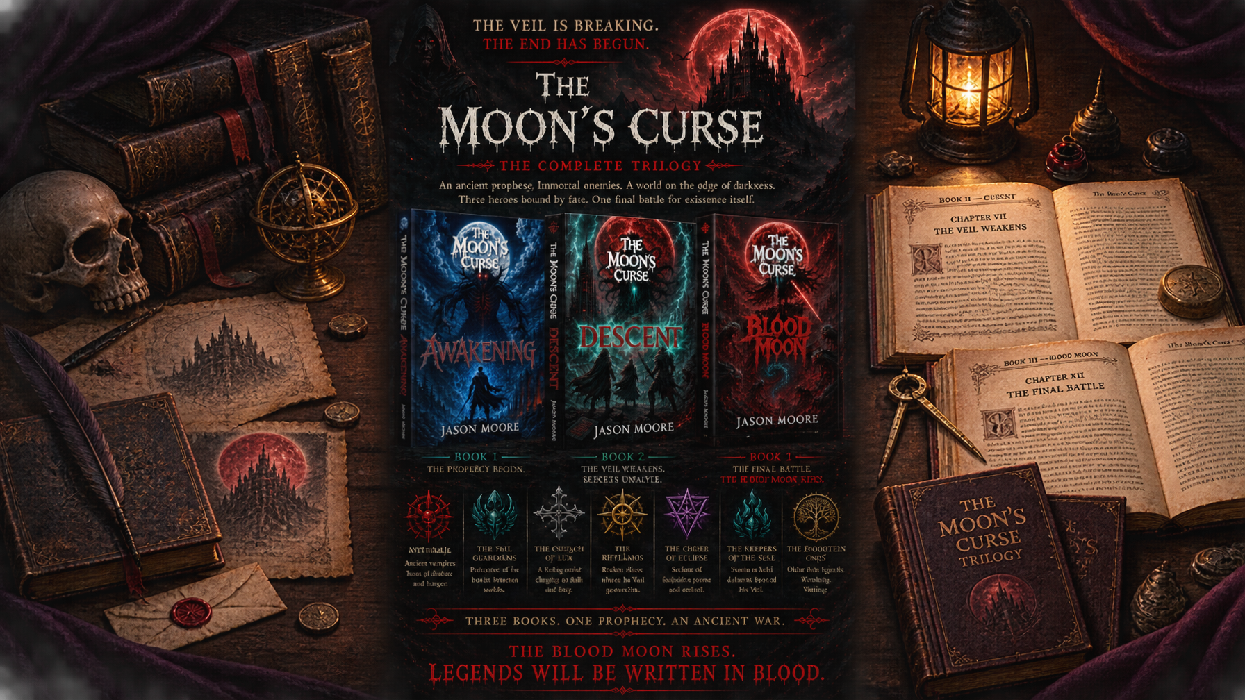
For independent publishers, series continuity is not limited to plot outlines; it extends to the shelf presence of the physical books. Because The Moon’s Curse Trilogy was completed and audited before release, every interior specification was locked across all three volumes simultaneously.
A reader transitioning from Awakening into Descent and finishing with Blood Moon encounters the exact same page proportions, baseline grid alignments, and typographic hierarchy. There are no sudden shifts in font scaling or altered margin ratios caused by changing interior designers mid-series. The trilogy stands as a single, coherent reading experience from the first line to the final page.
Step Beyond the Veil
Explore the complete edition of The Moon’s Curse Trilogy, crafted with relentless dedication to dark fantasy storytelling, tactile book craft, and deep worldbuilding. Discover Awakening, Descent, and Blood Moon in collector hardcover, paperback, and digital formats at londynpublishing.com or view the full catalog in our books collection.